All Templates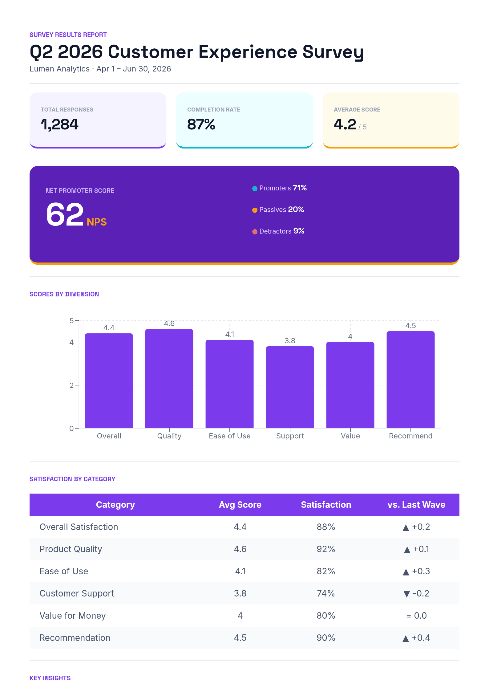
Survey Results Report
Preview
Data-dashboard survey report with metric tiles, an NPS band, a score bar chart, and satisfaction insights
A bright, dashboard-style report that turns raw survey responses into a shareable summary. Colorful metric tiles headline the sample size, completion rate, and average score; a bold NPS band with promoter/passive/detractor breakdown anchors the top; and a per-dimension bar chart makes strengths and weak spots obvious at a glance. The overall average is computed automatically with Diro's formula engine, so the headline number always matches the detail.
Below the hero, a satisfaction table reports each dimension's score, satisfaction rate, and trend versus the previous wave, and a numbered insights block distills the findings into action. The palette — electric violet with cyan and amber accents — reads like an analytics dashboard rather than a form, and every field maps to a survey question, so you can pipe results straight from a connected form or a spreadsheet.
Template Info
- Category
- Assessment
- Uses
- 1
Features
- ✓Colorful KPI tiles (responses, completion, average)
- ✓Large NPS band with promoter/detractor split
- ✓Per-dimension score bar chart (1–5 scale)
- ✓Auto-calculated overall average (AVG formula)
- ✓Category satisfaction table with trend vs. last wave
- ✓Numbered key-insights section